|
|
Post by C4Diver on Oct 18, 2007 12:37:09 GMT -5
change "305 BOYZ" to all CAPS
You used the wrong green for the biohazard background and the iside color of the diamond(where AFK is in). (look at the previous design you posted for the color I'm talking about).
Skull head/shape looks diffrent from original design. Keep the same outershape from previous skull
Yeah the teeth look better
|
|
|
|
Post by ShocK_13 on Oct 18, 2007 12:51:54 GMT -5
Don't stop trying what u have done, but hears an idea; why don't u get like a plain black T-shirt, and have them make the AFK logo printable. Just an idea, but do what u want.
|
|
|
|
Post by Kman2599 on Oct 18, 2007 12:55:11 GMT -5
This is the previous image. 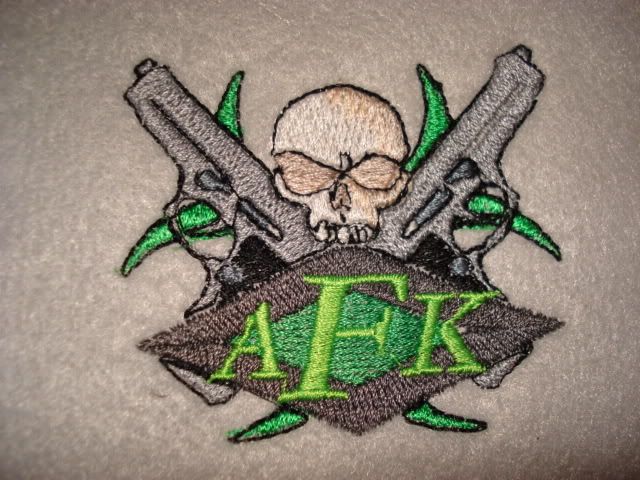 Here is the reworked, the only change to the skull was to complete the open part next to the eyes, and to change the eyes sockets to black. Getting the correct green is the easy part. Any thing else you spot, let me know, and I will get to it soon. 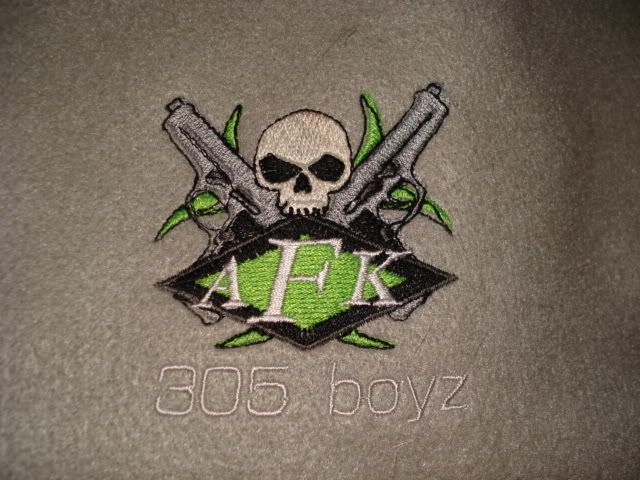 |
|
|
|
Post by aracanid on Oct 18, 2007 13:21:46 GMT -5
I am looking into having a t-shirt fitting the style of the one I posted earlier in the thread made by a local company. If the price is reasonable I will have it made and take some pics and if you guys want one I can get more made.
|
|
|
|
Post by C4Diver on Oct 18, 2007 14:55:29 GMT -5
CLiquework posted the image for the shirt a few pages back. You can copy the file and take it to a local shirt place and get your t-Shirts done.
Kman is working on an embroidered shirts and Hats, Not Silk screen Shirts
|
|
|
|
Post by C4Diver on Oct 18, 2007 15:00:15 GMT -5
This is the previous image.  Here is the reworked, the only change to the skull was to complete the open part next to the eyes, and to change the eyes sockets to black. Getting the correct green is the easy part. Any thing else you spot, let me know, and I will get to it soon.   Keep the outer indent of the skull from the original image, just decrease the eye sockets from the outside in the fill it in with black. |
|
|
|
Post by Kman2599 on Oct 18, 2007 15:10:53 GMT -5
I will show an updated photo soon. Any other thoughts, post tem and we will make a collective effort to get the design the way we want it.
|
|
|
|
Post by C4Diver on Oct 18, 2007 19:03:01 GMT -5
This is the previous image.  Here is the reworked, the only change to the skull was to complete the open part next to the eyes, and to change the eyes sockets to black. Getting the correct green is the easy part. Any thing else you spot, let me know, and I will get to it soon.  [/quote]  Keep the outer indent of the skull from the original image, just decrease the eye sockets from the outside in then fill them in with black. Look carefully at the original image cliquework designed with my input. See the eye sockets. that's how I want them. Look below:  |
|
|
|
Post by aracanid on Oct 20, 2007 16:06:08 GMT -5
ok, I have sent my local place another email with cliques pics included and such. It will have the large AFK skull logo printed on the back with WWW.AFK305BOYZ.COM written below, and on the from the small joined letter AFK symbol as a crest. However I am wondering if anyone will be intrested in buying one? For people in the UK delivery by DHL is £4 and the shirt should cost under £20 but I am unsure of price as off yet. If it is below £15 would anyone from the UK wish to purchase one and eventually people from USA etc? |
|
|
|
Post by bladeforever on Oct 20, 2007 17:36:47 GMT -5
man it's gonna look good! Can't wait for the final design kman!  |
|
|
|
Post by Kman2599 on Oct 21, 2007 18:09:16 GMT -5
Here you go, take a look and let me know what you think. 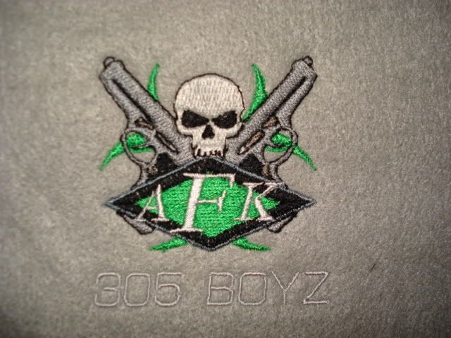 |
|
|
|
Post by C4Diver on Oct 21, 2007 21:23:48 GMT -5
Here you go, take a look and let me know what you think.  Looks alot better I love the skull now Perfect!!!. Are you missing a black outline for the radio-active symbol in the back? |
|
|
|
Post by Kman2599 on Oct 21, 2007 22:30:14 GMT -5
I removed the outlines from the radioactice symbol, because they kept not lining up and looking bad. I like it better without, but if you decide, I can put them back easy.
|
|
|
|
Post by ShocK_13 on Oct 22, 2007 2:16:52 GMT -5
That skull looks sweet Kman, nice work ;D
|
|
|
|
Post by C4Diver on Oct 22, 2007 11:39:41 GMT -5
I removed the outlines from the radioactice symbol, because they kept not lining up and looking bad. I like it better without, but if you decide, I can put them back easy. Looks good. Any recomendations from you or others on making it look any better? |
|